Confessions of a Mac Junkie: Spreadsheets

I don’t do a lot of serious work with spreadsheets. Most of my data either ends up getting dealt with in stats packages or if it’s something requiring anything custom, I’ll write a program of my own to deal with it. I use spreadsheets mostly for things like grade rosters, when I do my taxes, and for non-mission-critical work like fantasy football rankings.

I own three spreadsheets: Apple’s Numbers, Microsoft’s Excel, and Mariner Calc. Those of you who follow along here are probably expecting another round of Microsoft-bashing, so perhaps this will be a surprise, but I don’t think there’s any real contest here: Excel is clearly the champ here.

Before I get into this, another historical note: my favorite Mac spreadsheet used to be Informix Wingz, which was then later rebranded as Claris Resolve. Powerful functions, great graphics, and a macro language which was actually parseable by humans (based on HyperTalk, how cool is that?). This was software that was way, way ahead of its time in 1989—no current spreadsheet is nearly as good. Progress is, unfortunately, not always forward.

This is a battle of attrition: I don’t really like Excel all that much, but the other two are just not ready for prime time. Mariner Calc is OK, but it lacks the statistical functions that I need (like z-, t-, F- and chi square distributions), I’ve found more than one error in calculations (I’ve reported them and Mariner claims that they’re fixed, but who knows if there are more?), and the UI just doesn’t make it. For example, when you’re in a cell, the row and column indicators don’t change to indicate where you are in the spreadsheet, like so:

Untitled.r86ArkrhLy6p.jpg

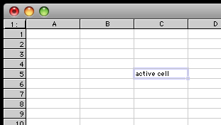
Not really that big a deal when you’re in C5, but when you’re in K39 it’s often useful to know, visually, what row and column you’re in—like in every other spreadsheet I’ve ever used. I requested this feature ages ago, but Mariner never did anything with it. This is just a dumb UI fail, a “please don’t buy our product” signal from the developers.

Now, Numbers. Numbers is an interesting effort from Apple, an attempt to kind of change the paradigm for spreadsheets. Instead of the “sheet” being the basic unit, the “table” is the central unit, and each sheet can have multiple tables—and of course each document can have multiple sheets. This is kind of interesting and there are certainly advantages to doing things this way, but it does add a lot of clutter if you just want one single very large table (and no others) because there’s all this screen real estate devoted to managing multiple tables in a sheet that you won’t need. OTOH, there are some cool things that this enables, as multiple separate tables on a single page can be useful, particularly for things that have to be printed out. So, there are things about Numbers that I like, but there are just as many that I hate. Here are the two things I hate the most:

• Exporting from a Numbers document is incredibly cumbersome. This is important, because lots of other apps like simple and dumb, but also highly portable, you-know-everything-will-be-able-to-read-it-in-10-years formats like tab-delimited text. First of all, Numbers doesn’t even support tab-delimited text. WTF? It supports CSV, but I hate CSV because CSV files aren’t as human-readable, and commas are crappy delimiters because lots of data has commas in it one way or another. Second, Numbers handles multiple sheets/tables incredibly stupidly: you can only export the entire document, every single sheet and table, or nothing. You can’t just export the part you want. Mind-numbing.

• Sorting is stupid. Numbers won’t let you sort only a part of a table; again, it’s all-or-nothing. (Technically, this isn’t quite true; it’s possible to sort only some rows, but when you do, it still sorts all columns for those rows. Ugh.) This just defies any reasonable logic whatsoever. Well, maybe that’s a little harsh. This completely defies my mental model for how a spreadsheet should work, and I can’t stand it. I don’t care how much of a “new paradigm” this thing is supposed to be, it should not completely break major chunks of previous knowledge about how spreadsheets work.

The other kind of stunning thing about Numbers is that there’s no way to edit a Numbers spreadsheet on an iPhone—at least, none that I’ve been able to find. The great irony is that there are many iPhone apps that will allow you to edit Excel spreadsheets on an iPhone, but not Numbers. (Double irony: Mariner’s Calc iPhone app will let you edit Excel sheets, but not Calc sheets. WTF?) Hey, Apple, fantastic job on platform integration there! (Side note: I like having small spreadsheets on my iPhone for small tasks, and usually all the editing I do is enter data onto them, but that’s enough that it’s useful.)

So, the winner—again, mostly by attrition—is Excel. I’m not thrilled with Excel, of course, as the launch time is hideously long and it has some UI quirks of its own, and of course is full of Microsoft bloat. However, Excel seems to do a better job of containing that bloat than the other Office apps and so it’s bearable. I think this is an area where a third-party really could compete with the big boys, but none has yet risen to the challenge.

Quick Review: TweetDeck for iPhone

My App Store review, in blog form…

First and foremost, I love the price. Free with no adware, that’s perfect for a Twitter client. I’d pay a buck, maybe two at most, for a Twitter client. Five bucks is right out.

However, TweetDeck has some issues:

• It crashes… often. Usually on launch, and other times for no apparent reason. This should be the developer’s #1 priority.
• It misses tweets! If someone you follow does an @reply but tries to broadcast it using “.@,” TweetDeck still doesn’t show it.
• I know the hipsters all love the white-on-black color scheme, but I’d really like at least the option to go with the more traditional black-on-white. This is particularly problematic in really bright light conditions.
• Needs better support for #hashtags. Right now they don’t do anything.
• I’d like the option to launch a URL in Safari rather than in TweetDeck itself.
• No landscape mode for composing tweets.

It’s a good start for a 1.0 and could be great… certainly worth hanging onto for the price, though I’m going to keep an eye on TweetFlip…

Confessions of a Mac Junkie: Presentations

First, some context: I give a substantial number of presentations, because I do a majority of my class lectures using presentation software. Thus, I probably give 50–100 presentations a year. This means I spend a fair amount of time in presentation software, so again, I’m rather particular about it. However, it should be pointed out that none of these are marketing or motivational talks; these are all technical in nature. They aren’t snazzy and I don’t make a lot of use of animation or fancy effects, because I want people focussed on the content, not the presentation itself.

There are really only two serious players in this market: Apple Keynote and Microsoft PowerPoint. There are a number of minor players in this market, whereby I mean software that really does something else, but also happens to support some kind of slide show or presentation features. This list includes things like OmniGraffle Pro, Curio, DeltaGraph, and I’m sure many, many others. Many of those are nice, but they aren’t really centered on presentations and I give enough that I need a dedicated tool.

This one is actually a no-brainer: Keynote is my tool of choice, hands down, no contest. Frankly, PowerPoint blows goats. There is almost nothing that PowerPoint does better than Keynote, and Keynote can read and write PowerPoint files, so why bother with it?

However, in the interest of fairness, there are a couple things PowerPoint does do better. The main thing is drawing. PowerPoint has a wider range of drawing tools, and handles things like arrowed connecters between objects dramatically better than Keynote. (Keynote only recently added arrowed connectors at all.) Mostly I don’t consider this a big deal, since if I’m going to do a really complex diagram I’m going to do it in a dedicated drawing program like OmniGraffle anyway. The one place where there’s some real advantage here is that if you want the diagram to appear in stages (that is, via animation), then you basically have to draw it in the presentation software, so PowerPoint does get a point over Keynote here.

However, that’s pretty much it. PowerPoint is slow, generally much klunkier to use, more expensive, and generally vile. The most amazing thing about PowerPoint is how it has consistently failed to improve from one version to the next. The 2008 version is just simply not better than the 2004 version. If you want to mess with the animation of your bullet points, this still requires digging through multi-level dialog boxes. I hear that if you’re using PowerPoint on Windows, it’s better. There’s irony there—is there serious competition for PowerPoint on the Windows side? My impression, though I admittedly don’t really know, is that there isn’t. Yet there is serious competition on the Mac side, and that competition is staggeringly better, yet PowerPoint doesn’t seem to be getting any better in order to compensate.

Note that it hasn’t always been this way. For a long time I used PowerPoint because of its superior support for equation editing in an external editor (MathType). Since one of the classes I teach every year is statistics, I need to present a lot of equations. So I’ve stuck with PowerPoint just for that feature. The current version of Keynote has stepped up and now supports MathType, and last fall I dumped PowerPoint completely.

If you’re still using PowerPoint on the Mac, I’d highly recommend you look at Apple’s Keynote; it’s just simply better.

Is it possible to be more wrong?

Gruber (over at Daring Fireball) is on his I-told-you-so (or maybe you-told-me-not-so) horse again, but this one is just too good not to link it: Dvorak on the iPhone in 2007. My favorite quotes: “There is no likelihood that Apple can be successful in a business this competitive” and “ I’d advise you to cover your eyes. You’re not going to like what you’ll see.” Really, John? About a million people sure liked what they saw this last weekend…

Confessions of a Mac Junkie: Input Devices

By input devices, I pretty much mean “mouse and keyboard.” Keyboard first:

The best keyboard ever made in terms of key feel, for me, is easy to identify: the Apple Extended Keyboard II (AEK2). Unfortunately, Apple stopped making those in the early 1990s, and they never made a version using USB. I gave up using my AEK2 in the late 1990s when I started seeing compatibility problems with the driver for the ADB-USB adapter.

Frankly, I don’t like any Apple keyboard offering; I don’t like the key feel for any of them. For many years, what I used was a Logitech Elite keyboard. The feel is not great, but better than the Apple keyboards around or any of the other third-party competitors that I got my hands on. Most current keyboards use membranes rather than individual switches for each key, which is why most modern keyboards feel mushy. I tried the Matias Tactile Pro which is supposed to use individual switches like the old AEK2, but the one I got was defective and the manufacturer never returned my attempts to contact them or return it, so I dumped it (and never got my money back—great customer service!). So, the solution ought to be a keyboard based on scissor switches, which is how the better laptop keyboard are made. The problem is that I don’t like the feel of most of those because the finger travel distance is too small.

Anyway, I did finally tire of the feel of the Logitech Elite, and briefly reverted to my old AEK2 when I discovered that the OS X drivers for the ADB-USB adapter worked pretty seamlessly. While I loved going back to that old feel, I still wasn’t satisfied, for multiple reasons. First, the 18-year-old keyboard sometimes dropped keystrokes (very bad), there are no media controls on the keyboard, and the keyboard is really loud. Keyboard loudness never used to bother me, but my life has changed since the late 1990s and now I do enough teleconferencing that a noisy keyboard is highly inconvenient.

Fortunately, someone finally made a decent Mac keyboard: the Logitech DiNovo Edge for the Mac. Yes, it’s terribly expensive. Yes, it lacks a numeric keypad. And it’s a scissor-switch keyboard. However, they’ve increased the travel distance over other scissor switch keyboards and the feel is pretty good—no, still not as good as the AEK2, but better than the Elite or any of Apple’s offerings. It has a great set of media keys as well as a trackpad and scrolling controls. It’s quiet. It’s low and flat, so it doesn’t screw up my negative-tilt keyboard shelf. It’s Bluetooth, which so far seems much less flaky than the wireless USB solutions I’ve used before. And as a final side benefit, it’s gorgeous, though that’s also probably a significant factor in the expense (the top is cut from a single piece of glass).

Next, the mouse. This is a terrific example of a technology where what’s good for learning is not what’s best for the skilled operator. From my perspective, it’s great to have lots of buttons on a mouse. However, if you want to see how this can fail, try teaching a 3-year-old to use a multi-button mouse. I’ve done this with both my kids, who are both smart and were motivated to learn. Small fingers aren’t the whole problem, the issue is the fact that with multiple options for clicking, they’ll use them all, won’t remember which to use, and cause glitches when they click with the wrong one. It’s a mess, because the left button is the one used some 90% of the time and the other button is just a distraction.

On the other hand, I’m not a little kid. In fact, I’ve been using a mouse more or less daily for the last 22 years. (As usual, insert your favorite age joke here.) At this point, I want a mouse with some extra buttons—in fact, lots of extra buttons! Of course a scroll wheel, but not just any old scroll wheel, one that also tilts to do horizontal scrolling. I like programmable buttons for “back,” click lock, close window, gesture, and Exposé. I’d rather not have to go back to the keyboard if I don’t have to, and this array of extra stuff right on the mouse allows me to keep it to a minimum. This rules out any Apple offering; the mighty mouse or whatever they call it lacks for extra buttons.

So, that’s a lot of extra buttons. I also like my mouse to have a good feel in my hand, track well, and wireless is also nice (Bluetooth preferred but not required.) If wireless, that means it will have an on-board battery so a battery charge indicator right on the mouse is also useful. Obviously, I’m pretty picky about this.

So far the mouse that I’ve found that best does all this is the Logitech Revolution MX, so that’s my desktop mouse. It’s quite excellent. I almost gave up on it when I first tried it because the shape is pretty extreme and I didn’t immediately like it, but it’s grown on me. I’m still not sure the previous-generation shape (e.g., the old MX700 or more recent G7?) isn’t actually better but I’m willing to live with the MX. It’d be even better with Bluetooth, of course, because as I said, wireless USB is sometimes kind of flaky.

So, there are my choices for keyboard and mouse. Yes, I’m a little OCD about it, I know, but I put a lot of hours in on them, so why not get good ones?

Final note on Logitech: I never had any intent of becoming a Logitech fan. And Logitech has an extremely sketchy track record when it comes to the software on the Mac side; Logitech Control Center is notoriously buggy. Turns out the DiNovo Edge is already a Mac keyboard and works just fine without the Logitech software. The mouse can be driven perfectly well with third-party shareware; both USB Overdrive and SteerMouse work great with Logitech mice. So I don’t run the Logitech software at all.

Confessions of a Mac Junkie: Web Browsers

At any given time, I probably have five or six Web browsers on my hard disk. I’ll look at and briefly play with just about anything floating around, or at least I used to—this is one area that I’ve slowed down on a little bit. But why bother playing with Web browsers? Because this is one of the most important pieces of software on the machine—who doesn’t have a Web browser open most of the time? Anything that commands as much of my time as a Web browser deserves some attention in terms of looking for the best one.

The fundamental problem, despite the fact that so much development time and effort goes into these—or maybe because of that—I don’t think there’s a clearly “best” Web browser out there, which is unfortunate. Fundamentally, I spend most of my time using three different browsers.

The first is OmniWeb. This is the browser in which I tend to spend most of my time. It’s not especially fast, it’s buggy and crashes more than it should, and it has occasional issues with compatibility with some Web sites. After that ringing endorsement, why is this one of my favorites? Because it has two things that it does better than other Web browsers:

• Site-specific settings. If you want some web sites to behave one way while other web sites to behave differently, then you want site-specific settings. Here’s an example: on most sites, when I click a link, I want it to go to that link in the current browser tab. However, for some sites, I want all links to launch in a new tab (or window). For example, when I do a search in Google, I want all the links to launch in new tabs so I don’t have to go back to the original search. For some sites I want to block all images, and in others I want to permit all images. OmniWeb not only allows for this, but makes it easy to do.

• Thumbnail tabs. Tabs with text titles aren’t really all that helpful, as they depend on Web sites to have meaningful and differentiable titles, and reading titles is slow anyway. If you want tabs that really work well, thumbnails are the way to go. There are plugins for other browsers which give something like this, but OmniWeb has been it doing it from the ground up for a long time and has implemented it in a much more smooth and fluid way. Like this:

Untitled.NiuiKcRZQmg9.jpg

When there’s only a single tab open, the drawer closes automatically, so it doesn’t eat up the screen space when you don’t want it to. It’s really well done.

The next browser is Safari. Particularly with Safari 4, this is a speed demon that renders most web sites quite well, and it does have some great bells and whistles, too, like the Firebug-like inspector (which I actually like better than FireBug itself). Safari is what I generally run whenever OmniWeb has trouble with a site.

The other thing that WebKit-based browsers on the Mac have is the completely awesome ClickToFlash plugin. What does this do? I’ll quote from the site: “ClickToFlash is a WebKit plug-in that prevents automatic loading of Adobe Flash content. If you want to see the content, you can opt-in by clicking on it or adding an entire site to the whitelist.” Mostly I think of Flash as the scourge of the web. Yes, sure, occasionally Flash is cool, but most Flash is just annoying, and most Flash videos are really crappy quality. Plus Flash is a stunning resource hog. Having all Flash off by default, but still available when you want it, is terrific. This makes it hard for any non-Webkit browser to get very far with me.

Speaking of non-Webkit browsers, the third most oft-launched browser for me is FireFox. Basically, I keep this around to deal with Web sites that have obviously never been tested on a WebKit browser on a Mac. Since FireFox is common enough in the Windows world, it can handle the few sites that I have to deal with that the Mac/WebKit system don’t handle well. Those sites are decreasing in frequency, so I don’t use it all that often anymore. This is fine with me, as I dislike FireFox it for its non-Mac-like interface. There are some cool plugins for FireFox, but now that Safari has out-FireBug’d FireBug, I rarely feel the need to play around with those.

What about others like iCab, Camino, Opera, Chrome, etc.? Each of them has interesting features, but there are always problems with bugginess or inability to render many pages or something. The best of the lot of others seems to be Opera, but it just doesn’t offer anything compelling to take me away from the other choices. Now, I haven’t played with the beta for version 10 yet, so maybe it now does, but I don’t have a sense of this yet.

My default browser is usually set to OmniWeb, but Safari is increasingly also running…

WWDC 2009 Reactions

Everyone else in Mac blog-land has been doing this for a while now. I know I’m behind but I was traveling for work the week of WWDC and blogging had to wait.

So, my reactions, in no particular order:

• I was really hoping for a refresh on the MacBook Pro line, and so I was thrilled with the this part. I ordered a new 15“ MacBook Pro that night. I’ll be handing down my 2007 (that’s pre-unibody) 15” MacBook pro to one of my grad students. I plan to give up the Mac Pro in my office to my lab since some of the new research we’re taking on will require a little more horsepower, and I plan to make the MacBook Pro my primary at-the-office machine as well as my traveling machine. I think the new top-end MBPs will actually have enough horsepower and storage to make this practical.

• iPhone 3G S. I don’t know, I guess it’s good. I have an iPhone 3G and the changes would be nice, but aren’t compelling enough to get me to shell out the outrageous dollars AT&T wants for an upgrade. Magnetometer? Meh, don’t care. Better camera? OK, but not a huge deal. Video? The phone I had pre-iPhone had video, and I don’t think I ever used it, not once. Wake me when it’s 720p, until then, meh. Faster CPU and more RAM? Well, OK, that’d be really nice. But that alone does not even come close to justifying the upgrade expense. Voice control. Well, first, this should have been on the initial iPhone. It’s a good thing to have, but again, not a huge deal. The whole package together is almost enough to get me to think about it, but still too damn pricey. For $200 I’d do it in a heartbeat. (Certainly, next year when Apple does the next iteration of this and I’ll have met the two-year contract, I’ll be more interested,)

$99 iPhone. I think this has gotten short shrift in the press and blog world (I hate the term “blogosphere”) because I think this is a huge deal. For a mere hundred bucks, people will be able to buy an excellent mobile computing experience, particularly given the 3.0 OS. I think this will do a lot more to grow market share than the 3G S. I’m already pretty amazed at how common iPhones are, and I suspect this will draw in a lot of people, as price is one of the three main things keeping people from going iPhone. (The other two are not being willing to give up a physical keyboard and being locked in to AT&T, both of which have legitimacy. AT&T sure seems to be working hard to keep the latter group away.) I think $100 is the “well, crap, for that price, why not get one?” price point. I suspect not just entirely new customers, but that a lot of spouses and children of current iPhone owners are about to join the club, too.

iPhone 3.0. Look, 3.0 will be a significant step forward, but we already knew that. The biggest deal is that it’s coming out soon, which is good. The “find my iPhone” thing is a nice bonus, to be sure, and that I didn’t see coming. Mostly what the 3.0 OS does, though, is [a] provide things that should have been fixed a while ago (cut & paste), and [b] make AT&T look bad. MMS I don’t give a crap about since I can just send pictures in email, which is perfectly fine. However, I’d love tethering. Yes, I get that AT&T’s 3G network is already being maxed out in places, primarily by the armies of iPhones already on the market. What I’m really worried about is that AT&T will have only one price plan for this, and that it’ll be some enormous monthly charge for unlimited tethering. I don’t intend to use it much so I don’t want to shell out for an unlimited plan. I’d really like a plan that let’s me pay like $10 for a one-day window of unlimited use, which I’d only hit every once in a while. I am not, however, optimistic about this.

The other thing I’d really like to see come along with 3.0 is someone developing an app that allows the iPhone to take an external keyboard such as the Bluetooth-based Logitech diNovo Mini. I would pay $10 for that ability in a heartbeat. Any iPhone app developers listening? Please? (One wonders if netbook vendors would pay to keep such a thing off the market. If I were Dell and MSI, the apparently leading vendors of netbooks hacked into running OS X, I would pay significant dollars to buy out developers about to release such software.)

• Snow Leopard. Nice price point, that’s for sure. Clearly, Apple really wants everyone to upgrade. I’m glad it’s not too soon, too, as Leopard is itself very good and I worry about Snow Leopard breaking stuff, and I’m in no hurry for that. Hopefully it won’t break too much but you never know. One thing I’m still not sure about: will Rosetta still run under Snow Leopard? This is hugely important to me and if the answer is “no,” then it will be a long time before I upgrade. I know Apple is still trying to wean everyone off the PowerPC but dammit, I only just got a Lisp environment (niche enough for you?) that doesn’t suck that runs on Leopard in Rosetta, and if Snow Leopard breaks it, well, then 10.6 will just have to wait. Windows, with all its faults, does one thing incredibly well: backward compatibility. Not exactly Apple’s strong point. There’s something to be said for doing a better job of looking forward because they aren’t as concerned with looking back, but still, I’d like to at least occasionally be able to run something that’s really only a few years old.

OK, what’d I miss?

Ripped DVD vs. Blu-Ray Digital Copy

One of the serious drawbacks of blu-ray is that it’s exceedingly difficult to rip a blu-ray disc into a form usable on, say, an iPod or AppleTV (not that an AppleTV can actually handle 1080p, but that’s a separate problem). Blu-ray folks understand this limitation, and so some blu-ray movies come with a “digital copy,” which generally is a DRM-protected MP4 movie file.

When buying blu-ray discs for movies I don’t have, I’ve tried to to steer toward those with a digital copy included. However, some movies apparently include a digital copy even though this isn’t made explicit. In particular, the copy of the The Matrix that I picked up on blu-ray includes a digital copy, even though it doesn’t say so.

The Matrix was the first DVD that I owned, and was arguably the “killer app” that really launched DVD in the first place. I’ve ripped it many times at different sizes and bitrates; this is the movie I used to use to see how much playing with the dimensions and bitrates of the rip affected the picture quality. So, of course, I have a ripped version on my hard disk for watching on the AppleTV. So I thought I’d take a look at how it compared to the digital copy which came with the blu-ray.

First, some information on the the files: the rip was done using Handbrake 0.9.3, 63% quality, full-size loose anamorphic. The resulting file is 2.77 GB, 838 x 352 pixels. The digital copy is 1.59 GB, 853 x 354 pixels. So the digital copy is a much smaller file, but some of that is due to the fact that the ripped file has the full Dolby AC3 5.1 audio in it, while the digital copy has only a stereo AAC track. Still, the video-only part of the ripped version is about 2 GB, so it is running at a higher bitrate.

But how do the results compare? Actually the difference is quite striking right as soon as you see the Warner Bros. logo: digital copy and ripped. The colors in the digital copy are obviously much more saturated.

However, the ripped version appears to be a little sharper than the digital copy, at least on rendering text. I suspect that this is a result of the higher bitrate in the ripped version.

A great illustration of the difference between the two can be seen in this shot of Trinity: ripped vs. digital copy. The colors are much different and the digital copy shows some banding (particularly around the flashlight on the right), which again might be a bitrate issue. (Note that this is less visible when it’s moving video).

OK, so last one, not in the Matrix, but in the “real world:” ripped vs. digital copy. As per the other, the ripped one shows more detail, but the colors are a bit different; perhaps slightly better in the digital copy.

So, you can judge for yourself if the digital copy is acceptable. My take is that it’s OK for how I’ll actually use it; that is, primarily on my iPhone. I won’t watch it on the AppleTV since in my living room I can watch it in blu-ray, and the BD is absolutely fantastic. Now, when I travel I sometimes hook up my iPhone to a TV, but that’s at best with s-video, so the slight loss in detail and lack of 5.1 audio is acceptable, and the smaller file size is welcome. Overall, I’m happy with the digital copy and now I really wish all blu-ray discs came with one.

Confessions of a Mac Junkie: Word Processors

A long time ago (late 1980s) the best word processor for the Mac was Microsoft Word version 4.0, no contest. Basically, it was that or vanilla MacWrite. Word was much smaller then, more lightweight. Edges of the bloat could be seen with version 5, and version 6 was one of the most colossal disasters in office software history. I’ve also owned Write Now, MacWrite II, MacWrite Pro, various flavors of Nisus Writer, WordPerfect Mac, ClarisWorks/AppleWorks, FrameMaker, Mariner Write, Pages, and I’ve taken several others for test drives (Mellel, a few others whose names I can’t remember). There is a clear winner in terms of history for the best word processor for the Mac, ever. In my opinion, MacWrite Pro was, hands down, the king. Things printed where you put them. Style sheets always made sense and worked in sensible, predicable ways, and there was a differentiation between character styles and paragraph styles that promoted a mental model of the system that actually worked. It had just enough page-layout-style features that you could control things, but it never overwhelmed you with that stuff.

mwp.Yt0uRq2CyBCH.jpg

But, unfortunately, MacWrite Pro is dead. The last version released was a long time ago, and once development stopped, it didn’t last long, mostly because it had issues with newer printer drivers, and if you can’t print properly from your word processor, it’s done.

Now, because I’ve tried so many, I now have a standard test I do when I take any new word processor for a spin. Before I get into that, though, I think it’s important to mention what kind of writing I typically do with word processors, because what works for me might not work for other people depending on what kind of writing you do.

I’m an academic, but I don’t write books. I write scientific journal articles, conference papers, book chapters, and grant proposals send to federal agencies. I also write exams and homework assignments and answer keys for those. I write almost no memos or letters; that’s what email is for in my world. I don’t write fiction, advertisements, brochures, forms, or anything like that. I don’t use my word processor as an outliner; I have an outliner for that. (Yes, there will be a series entry on outliners.) So, my primary use is technical writing.

So, what’s my fist test? I try to generate a document in what I think of as “conference proceedings format.” This is pretty straightforward two-column format, which virtually all word processors can handle with very little pain. The tricky bit is that the first page is different; it requires a single-column start with the paper tile, author information, and sometimes abstract. I also need style sheets to handle various heading levels, figure captions, and body text that sometimes does and does not require a first-line indent depending on whether or not it follows a heading. Maybe this doesn’t sound complicated and it definitely should not be hard for someone with a graduate degree in computer science to figure out.

Most word processors, however, make this task way, way more difficult than it should be. I can usually get most word processors to do it, more or less, but the issue isn’t usually whether or not they can, but how much of a pain in the ass it is to get it running and how sensible the outcome is in terms of mapping from what it shows on the screen to what gets printed on the page. I dislike most implementations that require “sections” to do this. Doing it with a header that appears only on the first page is OK, but doing it with a WYSIWYG text box is the clearest and easiest way I’ve seen to handle this. This is, of course, how MacWrite Pro handled this.

When MacWrite Pro was no longer feasible to run, then I switched to FrameMaker for a while, but that never made the OS X transition, so that wasn’t a viable option. I had been floating around trying different things, none of them quite what I wanted. Mariner Write is non-awful and Nisus Writer Pro has some things going for it, but neither is quite it.

A word, then, on Microsoft Word. I hate Word with a passion. It’s slow (NASA launches things faster), it’s bloated with zillions of features that I will never, ever use, the UI is klunky (exactly how many modal dialog boxes are there?), the implementation of style sheets is horrible, its behavior is completely unpredictable (gee, I wonder where that figure will actually end up, or how it will reformat my text if I somehow accidentally delete the invisible formatting character), and so on. It’s a mess. I only use it when I absolutely have to, generally because I’m working with a colleague who uses it. Even then, I’ll generally translate from Word, edit in something else, and then save back to Word. This is not to say everything about Word is bad, as Word has been the source of some very good ideas. For instance, the first time I saw the dynamic red underlining of misspelled words was in Word, and even if Word didn’t invent that, it popularized it, and that’s a seriously good bit of UI.

So, what I use is Apple’s Pages. It’s the closest thing to MacWrite Pro out there, it’ll always run on the latest Apple hardware and software, it plays surprisingly well with Word, and the UI doesn’t suck. It’s certainly not because it’s an Apple product; I have to say that the first couple of versions of Pages weren’t especially great, and I didn’t really use it. However, the 3.0 (or ‘08) version (actually released in 2007) was good and the 4.0 (or ‘09) version is a useful improvement over that. When people email me Word documents, I almost always open them in Pages because it takes dramatically less time to launch Word and Pages usually does an excellent job of importing with formatting intact. And as much as I dislike “track changes,” Pages does a good job with it and generally handles Word files that have this turned on quite well.

However, it’s not perfect. For example, MacWrite Pro’s style sheets were still better, and it’d be nice if Pages did auto-numbering of figures and equations, but other than that, it’s good enough that I almost don’t miss MacWrite Pro anymore, which is an accomplishment. So, that’s what I use. For now, until someone finds something better.

Confessions of a Mac Junkie: Introduction

OK, so it’s not football season and my blog is suffering from neglect. But classes are over and I can only watch so many movies, even on blu-ray, in a week. The last couple summers I’ve used the little down time I have in the summer to read a couple novels. Since the sequel to The Name of the Wind isn’t going to be out for a while, nothing on that front really grabs me right now. Thus I’m starting a new series on the blog, which I’ll try to update about once a week. So, what is this all about?

I’ve been using Macs since I started college in 1987 (insert your own age joke here). One of the things I often find myself asking when I meet other Mac aficionados is “what X do you use?” where X is software for some particular purpose, or hardware, or whatever. And I’ve noticed over the last few years that people ask me that question a lot.

So, I thought I’d document some of the storehouse of Mac knowledge and preference buried in my brain. Why should anyone care? Well, I have to confess that I have a problem: I’m a junkie. I’m completely addicted to Mac stuff, hardware, software, peripherals, you name it. There are (at least) four fully licensed word processors and at least three such spreadsheet programs on my hard disk. There are probably five or six keyboards in my study right now. I spring for MacUpdate Promo bundles and MacHeist bundles pretty much whenever they happen. I am, sadly but most definitely, addicted to this stuff—but it means my opinions are generally pretty well-informed and backed by a fair amount of experience.

Here are some planned topics, though I probably won’t go in this order:
• Word processors (and maybe reference managers)
• Mice & keyboards
• Web browsers
• Presentation software
• Utilities (this will take many posts as I’m especially addicted to these; I’ll need to generate multiple sub-categories)
• Spreadsheets
• Audio editing
• How I keep my multiple Macs in sync (I get asked this particularly often)
• Drawing and diagrams
• Graphing
• Outlining/brainstorming
• Text editing
• Image editing for the non-’shopper?
• Blogging/twittering?

And I’m open for suggestions on others. Let my addiction work for you…

One last sidebar. This will most definitely not be any kind of Mac vs. PC holy war stuff. I find that tiresome. I made a choice, it’s my choice, it’s not a choice borne of ignorance or incompetence, and I really don’t give a rip if there are people who don’t agree with it. Nor do I expect other people to be swayed by my choice, so I’m not going there. If you want that kind of utterly unproductive nonsense I’m sure there’s a thread on Fark or Gizmodo where people are fighting it out—there nearly always is.

Now, I will dip my toes into some the muddy waters of dissent on the Mac side, because it is germane to the topic. LaunchBar vs. QuickSilver. BBEdit vs. other text editors. There will be Microsoft-bashing, but only for some applications; and don’t worry, there will be Apple-bashing, too.