Hey, wow, a non-MTG post from me. I know, it’s been a very long time indeed…
Introduction
In summer of 2008, I went car shopping and even test drove several competitors. I ultimately bought a 2008.5 MazdaSPEED3 because while the Mini was great, it was so much less practical and so much more expensive than the Mazda that I simply could not justify it. Anyway, “2008.5” is kind of an odd designation, but Mazda did a mid-year refresh on the Speed3 and it essentially the same as the 2009 model. This is before the current generation and the giant grin that Mazda gave the front end to all the 3-series cars. Frankly, I think the new ones are goofy-looking in most colors, and I don’t care for the hood scoop now sported by the Speed3.
I wrote a post about it at 1500 miles and, four years later, not a lot has changed about how I feel about it.
Here’s the best way to explain how those 50,000 miles have gone: I’m one of those people who, whenever in a bookstore, used to always pick up Car and Driver or Road and Track. I was constantly on the lookout for new options to think about in cars. I never do this anymore and now actively dread the idea of looking for a new car. For the first time ever, I want this car to last forever. I know it won’t, but I have never been happier with a car than I am with this one. That’s pretty unusual for me. Here’s my breakdown…
Performance
This is, of course, the major selling point of this car and the reason I bought it in the first place. It has never ceased to deliver on this. The car is a total blast to drive. It’s quick, it’s fast, and it corners incredibly well. The important thing is that it’s just as zippy and fun now as it was when I first got it—it hasn’t slowed down, and the feeling of fun when driving it has never gotten old. Of course, now it’s more familiar. I know exactly how hard I can corner before the stability control will kick in. Or, rather, I know exactly when i need to turn the stability control off when I don’t want it. I know where the car’s limits are, or more particularly, where the limits are for the combination of me and this car. I’ve never actually owned a car like this before and the long-term issue it has created is that it will be very hard for me to ever go back to something that isn’t as quick or handles as well. I’ve become quite good at managing the torque steer, which isn’t great but is managed adequately well by the computer. One of the funniest parts about the performance aspect of the car is the response from friends and neighbors. One of my son’s best friends just loves it when I’m giving him a ride somewhere and he’s always asking me to punch it or take corners fast. “I love your dad’s car” is something I’ve heard more than once. Always good to have the kid fun seal of approval.
Utility
This was one of the major factors in choosing this car over the MINI in the first place, and I had no idea how big a deal it would turn out to be. One of my sons plays football, and the other plays lacrosse, and there is simply no possible way, even in the Clubman version of the MINI that I could fit the gear for both of them in my trunk. My wife drives a good sized crossover, so I rarely need to lug big loads, but the ability to handle all the kids’ stuff is a requirement, and this car can do it, just. I have become a huge fan of the hatchback form—it’s just so bloody useful, without being a lumbering hulk.
Operating costs
This is, of course, the thing you really learn only after you’ve owned a car for a long time. How has it held up? How much does it cost to keep on the road? I’m breaking this down into three categories:
Maintenance/reliability
Other than routine maintenance, the car has only been in the shop a three times in 50,000 miles. That’s pretty good, with one notable exception that I’ll cover last. The first time was for a faulty gas cap, which was something the dealer knew about and that they fixed in less than five minutes for free. It was annoying because I was out of town and it failed for my wife, which caused her some undue stress, but it was minor. Another was a lit Check Engine light that turned out to be due to a faulty sensor, total cost less than $100. There was a recall on the windshield wiper motor, but I didn’t make a special trip for that, I just had them take care of it when I was in for some other routing maintenance, probably the 30,000 mile service.
The one really bad moment was, of course, one week after my 3-year warranty expired. What happened to the guy who took these pictures is exactly what happened to me:
Broken Shifter 1
Broken Shifter 2
Shift lever snapped off as I was shifting into 5th getting on the highway. Loads of fun!
My suspicion was that the bottom of the shift lever was cracked ever so slightly when they drilled the hole for the pin that holds it in place, and it took three years to finally fail. Or rather, three years and one week, since it failed eight days after the warranty expired. It was kind of scary to have the shifter just come off the car mid-shift as I was merging onto the highway, but the highway wasn’t busy so I just pulled onto the shoulder and checked it out. The car was still drivable, though probably not the safest thing in the world. I brought it to the dealer and, despite it being out of warranty, they fixed it quickly and without charging me a dime. I suspect, given that I’m not the only one who experienced this failure and the speed with which it was handled, that Mazda knows that this happens every once in a while, and they just quietly take care of it.
So, while that last one was a little odd, other than that, the car has been almost bulletproof. And let’s be clear about this—I drive the car hard. This will come up again soon.
Fuel
If you’re buying a performance car, gas is not your primary concern, nor was it mine when I bought it. Interestingly, though, my car was the first model year under the revised EPA mileage estimation procedures. The car is rated 26 highway and 18 city, and I do indeed drive about 50/50 city/highway. Since this car is my first in the smartphone era, I have a little app that tracks mileage. Here’s the graph for 184 tanks of gas that have been put in the car—I started tracking this at 792 miles in, so I missed the first few tanks. Note the green region above the EPA numbers and the pink region below it:
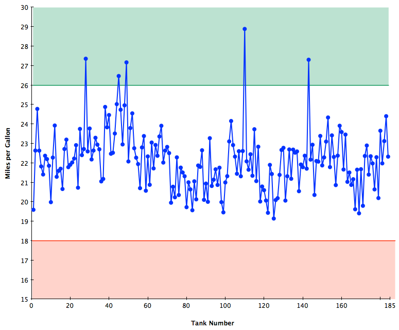
All those large peaks that reach into the green are mostly-highway road trips. So, the overall answer is that the car can beat the EPA estimate on the highway when using cruise control going not too terribly fast, but for me that’s pretty rare. The good news is that it has never dipped below the city number, and the overall average is almost exactly 22 MPG, the average of the EPA estimates. So, at least for me, the new EPA procedure is pretty good. Also, the car does about what it should do in terms of gas consumption.
Note that the Speed3 requires premium gas—performance engines often do—so I’m also paying a little extra. The app tracks price paid per gallon as well. My cheapest per gallon was $1.68 in December of 2008, and my most expensive was the horrible price-gouging station closest to my work, a lovely $4.28 per gallon April 2012. The average price per gallon has been $3.15 over the slightly more than 4 years that I’ve owned it.
Tires
The car has 18” wheels and uses low-profile tires for a sporty look and feel, and of course it’s a performance car. Additionally, I live in Houston, which is very hot for a substantial portion of the year. This is really hard on tires. Plus, I have a rather, err, spirited driving style. The reason for all this disclaimer-style material? I’ve never gotten even 20,000 miles on a set of tires. Yes, I rotate them every 6000-8000 miles. I went on to my third set of tires at around 38,000 miles, and at 50k I can see the writing on the wall for the next set—maybe I can wring another 7,000 out of the current set, but that puts me in about July when the tires will wear really quickly. Given that a set of tires with installation runs around $800 and I’m doing it about every 18 months, that’s not awful, but not insubstantial. In general I tend to be hard on tires, and Houston in hard on tires, and this car is hard on tires, so… yeah, tires are going to be a thing. Incidentally, the stock tires were Bridgestone Potenzas and that’s what I replaced them with the first time (though I think a different model number Potenzas), and this time around I went with Goodyear Eagles because they were on substantial sale at the Mazda dealer when I happened to need them. These seem to be holding up slightly better, but we’ll see for sure this summer.
Summary
So, after 50,000 miles, I’m still in love with the car. It’s still a blast to drive and doesn’t feel like it’s been obsoleted on features (yet), it’s still comfortable and overall not too expensive to operate, or at least not more expensive than could be expected. With one exception, it’s been essentially bulletproof from a mechanical standpoint, and all together, that makes it a terrific car in my book. May it last me another 50,000 (at least).