Review: OmniOuliner for iPad

It’s been a while since I did any kind of tech review, but this one needs to get out there. I’ve been meaning to do it for ages and just haven’t had the time. Well, I still don’t, but here I go anyway.

First, for anyone reading this who doesn’t know, The Omni Group is an Apple-only software shop that makes what I consider to be some of the best applications out there. OmniOutliner Pro and OmniGraffle Pro for the Mac are absolutely top-notch. In fact, OmniOutliner Pro for the Mac is one of may all-time favorite applications anywhere ever on any computer, right up there with MacWrite Pro back in the day. My hard drive is littered with probably a thousand OmniOutliner documents.

Now, I also love my iPad, and I put off getting one for a long time because Omni hadn’t released OmniOutliner for it. I did finally cave before the release, but I really missed having a top-notch outliner for the iPad.

So, with all that praise floating around, how is OmniOutliner for iPad (hereafter just “OO”)?

Unfortunately, my reaction to is is mixed. While it’s certainly the best dedicated outliner I’ve seen for the iPad, that’s not saying to terribly much, though CarbonFin Outliner is pretty decent. The fundamental problem is that OO doesn’t live up to the Mac version. This is slightly odd for Omni, since the iPad version of OmniFocus is actually far superior to the Mac version, and OmniGraffle is quite comparable on both platforms.

Omni certainly got a lot of things right on the iPad version of Outliner. It generally looks good, it’s responsive, it’s packed with features like full multi-column support, has a good set of starter templates, etc. Omni obviously put a lot of work into it.

But, unfortunately, they didn’t get it all right, and this is where I get into the mixed feelings part. Let me describe what I think are the most major flaws:

The Document Manager
Unfortunately, OO uses the same kind of document manager as Apple’s productivity apps like Pages and Keynote. Unfortunately, it’s not very good. It’s fine when you have only a few documents, but it doesn’t scale very well. As I noted above, I use OO all the time on my desktop, and I want to do that on my iPad as well. Unfortunately it just doesn’t scale. If you have even 30 documents, it becomes very cumbersome to manage. There are no folders and no search facilities, just view by modification date or file name. This is a pretty major stumbling block, and while it is one shared by numerous other iPad apps, i feel it more with OO than with any other app, since I tend to generate lots of outlines. (This is my preferred way to take notes in meetings, for example.) GoodReader is an example of an application that does this much better. No, GoodReader’s document manager isn’t pretty, but it scales a heck of a lot better.

Mac Synchronization
This is also a really important thing for me, to be able to share outlines between my iPad and my Mac(s). OO is pretty bad at this as well. First, it doesn’t support DropBox, which is a shame, only WebDAV and iDisk. (And iDisk is going away anyway. More on that in a bit.) iDisk support isn’t very good, though some of this isn’t Omni’s fault—iDisk has always been a dog for me. The real problem, however, is that it doesn’t actually synchronize at all. It will make a copy of something on iDisk, and you can save a copy of a document to iDisk, but those are only copies. It doesn’t sync. This means I constantly have to check and re-check to see whether the most recent version of any particular document is on iDisk or on the iPad. Again, GoodReader has this problem solved reasonably cleanly, storing a link to the document on the sever and supporting a “sync” button that figures out who’s newer and syncs it.

Now, I would guess that in the future Omni will support iCloud and this will get somewhat better—if you can use iCloud. Unfortunately, for work I still need some old applications that only run under Rosetta, so I can’t upgrade to Lion yet, so I can’t use iCloud. (Also, some of my favorite Mac software isn’t Lion-ready yet, which is a separate rant for another time.)

Mac Incompatibilities
Another other big problem is that there are number of very annoying incompatibilities between the iPad and the Mac that OO simply does not handle well. For example, I find that to look right on the iPad, I need documents zoomed in to about 125%. Unfortunately, when you open that document back up on the Mac, it remains zoomed in at 125%, and there is no way to change the zoom level on the Mac version of OO. Argh! (Actually, I’ve figured out a way to deal with the problem, which qualifies as a horrible hack: If you open the raw XML of the OO document on the Mac with a text editor like BBEdit, you can actually find the setting buried in the XML and change it back to 100%. Not fun.) There are also problems going the other way. If the document on the Mac side is in a font that doesn’t exist on the iPad, it obviously can’t use that font—but then it throws away all font information in the whole document. All the bold, italics, size changes, etc. are wiped out when you open it on the iPad. Look, I understand that Gil Sans (or whatever) doesn’t exist on the iPad, but it’s not like bold doesn’t exist. Why is that information lost?

Missing Functionality/Feature Requests
This might be getting a little nitipicky, but I really like being able to attach audio to my outlines, which is something that is available on the Mac side. As I mentioned, I like to use OO as my note-taking app in meetings, and it would be GREAT to be able to record audio snippets as annotations. I guess this is more of a feature request than missing functionality.

The other thing I desperately want is the ability to print. Amazingly, there are times when I want to be able to have hardcopy, and as far as I can tell, there’s no easy way to do this from OO. It can be done, badly, by exporting the outline to some other app that does know how to print, but again, this is a pain and the results often aren’t quite what I want.

My Other UI Gripe
The last thing on my list is another user interface gripe (the document manager being the first one). One of the most important features of an outliner, from my point of view, is use as a hierarchical checklist. Fortunately, OO supports this, but its support for this is pretty awful from a UI standpoint. Fundamentally, where you want the checkboxes to be is on the left side with the start of each line of text, and you want those checkboxes to indent as the text indents. This is exactly what the Mac version does, and what every even half-decent outliner I’ve seen anywhere else does (including CarbonFin Outliner on the iPad/iPhone). Unfortunately, OO for iPad treats the checkboxes not as a property of each row, but as an entirely separate column, and this column is rendered on the right, away from the leading edge of the text. This is, not to put too fine a point on it, a truly awful bit of UI. Usually Omni is really good about UI stuff (one of the reasons I’m normally such a fan), so this seems very out of character.

Now, despite all those things, I still use OO for iPad fairly regularly. In fact, I even generated the outline for this review on it! It’s still a good iPad app, and it’s still a fairly early release, so I’m optimistic that some of these will be addressed in future updates, though I have concerns about how soon such things will be available given that OO for Mac has been at version 3 since early 2005(!). OmniOutliner for iPad does fall short in some key areas that prevent me from using in the way I would like to use it. Most of those issues are ironically enough that OO for iPad is difficult to use with the Mac version of OmniOutliner. If your planned use of OO for iPad is as a standalone, then I’d rate it higher. But using it with the Mac version is frustrating and klunky, not things I generally associate with Omni Group products.
Ascend Acoustics Sierra-1 NrT Review

I have yet to see a decent-length review of these speakers yet so I thought I should get one up before the Web is flooded with them, though perhaps this is enough of a boutique item that won’t actually happen anyway. We’ll see.

What is the Ascend Acoustics Sierra-1 NrT?

It’s a speaker you cannot actually buy right now, but will be able to perhaps sometime soon. Essentially, it is an upgraded version of the highly-regarded Sierra-1. Ascend has allowed owners of the Sierra-1 to upgrade before the Sierra-1 NrT is made available. I am one such owner so I did the upgrade.

The original Sierra-1 is a very, very good speaker for the money. I posted some initial reactions to the speakers not too long after I got them. Since that post I’d done some shopping around while I was still in my 30-day return window. Local dealers aren’t abundant anymore and those that are around are scattered to the four winds here. I went with a friend of mine and we listened to some other speakers, then came back to my house and ran the same music through the Sierra-1s. We listened to the Focal Chorus 706V and the Paradigm Studio 20. On my own, I also listened to the B&W 685 and the B&W CM1. Frankly, the Sierra-1 is a markedly better speaker than all of these. The Focals were, IMO, absolutely awful with no midrange whatsoever. The B&W 685s have a very congested midrange. After I had heard them I found a review that said it much better than I could: they are like listening to music with a heavy beige quilt draped between you and the music. I couldn’t agree more. I liked the CM1s better than the 685s, but they just have no bass at all, which didn’t cut it for me. The only thing that came close was the Paradigm Studio 20s, which only somewhat close. Bass on the 20s is very good, but still not quite as tight and controlled as the Sierra-1s. The Sierras image better and have a cleaner midrange. The only thing I liked better on the Paradigms was the very top end. The metal domes give the tweeters more sizzle, though in the case of the Studio 20s it might be too much of a good thing and I found them a little harsh with violins. And, of course, the Paradigms are more expensive.

The friend I took with me to listen to the Focals and Paradigms, when he heard the Sierra-1s, almost immediately said “do not send these back—nothing we heard today was even close.” Well, I thought the Paradigms were vaguely close, at least at the high end.

My father, who currently has a lovely Sonus Faber setup, also concurred that he’d never heard anything like the Sierra-1s in their price range. He still likes his Fabers better, of course, but it’s not like that’s the same price class.

Anyway, the point I’m trying to convey here is that the “vanilla” Sierra-1 is an excellent speaker for the price. I really, really liked them, with only a minor quibble about high-frequency performance.

How Is the NrT Different?

There are two differences between the original Sierra-1 and the NrT version. First, the NrT uses a different tweeter. The original tweeter was made by SEAS of Norway, and so is the new one. The new one uses a much lighter but more powerful neodymium magnet in a “ring” configuration. (“NrT” stands for “neodymium ring tweeter.”) The tweeter housing is the same size so the new tweeter simply drops into place.

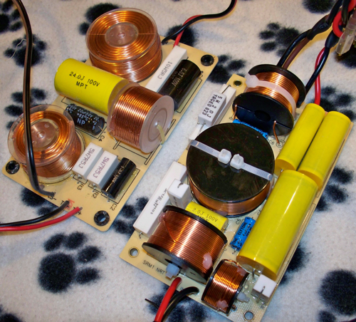
However, it would be pure foolishness to put a new tweeter, with different performance characteristics, into a speaker and just be done with it. The crossover also had to change—and change it certainly did. Check out the picture of the two crossovers (old one on the left, click to embiggen):

crossovers_small-2011-06-6-21-45.png

The new crossovers are supporting some serious caps and loops.

So, what is the new tech supposed to do? The primary thing I was looking for is more sparkle at the top end. The soft dome tweeters on the original Sierra-a are just a smidge too smooth for me, even in cases where I wanted them to be more edgy. Note that was I was looking for was not simply a more forward presentation. I tend to dislike overly forward sound; for example, I don’t care for Grado headphones because of this. I just wanted, and was promised, more overall crispness on the high end. The manufacturer described the difference like this:

This new tweeter is fast, delicate and with loads of top-end air. It is the perfect solution for those that like the advantages of a soft dome but yet miss some of the positive aspects of a metal dome.

and this:

The upgraded tweeter is sharper and quicker, there is a noticeable improvement in attack and decay, such that instruments have more *snap* to them, a more concise impact. For example, with cymbals, the impact is clearly more defined with more delicacy and shimmer.

and this:

I should mention that there is a lot more to this new tweeter than frequency response improvements. Improved damping, better transient accuracy, higher power handling, better cooling and lower distortion — but I feel the most obvious way to visualize the improvement is to simply compare the response measurements.

And those are exactly the kind of things that I wanted, so I took the plunge and plunked down for the upgrade.

Ascend gave two options for the upgrade: ship the speakers back to them and have them do it, or have the parts shipped to you and do it yourself. I chose the latter option. The upgrade was easy to to do, requiring pretty much just a screwdriver and a small wrench, and the nice folks at Ascend provided both paper and video instructions on doing the upgrade. I was a little paranoid doing the first one and it took me probably 25 minutes. With better familiarity and working with less paranoia, I did the second in between 10 and 15 minutes. These times do not count the time to wipe down the speakers afterward, as I have the high-gloss finish and I managed to cover them in fingerprints, which I just couldn’t leave.

Did the NrT Deliver?

In a word, yes. The NrT setup not only provides the desired sparkle at the high end, rendering cymbals with appropriate sizzle, but it has opened up the speakers even further. The soundstage is wider and imaging overall even better, which I’m not sure I would have thought possible for speakers that already excelled in these areas. There is additional clarity starting in the upper midrange, making female vocals even more airy and compelling.

Some specific thoughts based on my Audio Test Mix:

* Cymbals, cymbals, cymbals. This is what I was really looking for, and it came through in spades. Marked improvements in “Every Little Thing She Does Is Magic,” “Oasis,” and “Root Beer.” This was the only thing I thought the metal-domed Paradigms did better than the Sierra-1, and now the crown here goes back to Ascend. Absolutely nailed it here, though I wasn’t terribly surprised because this is what was promised.

* The place where the NrT most surprised me was the acoustic guitar, particularly the Rodrigo y Gabriela piece “Hanuman.” The additional crispness and detail was probably most felt, and most impressive, here. The NrT upgrade improved not only the high end, but the midrange as well, quite significantly. Anecdote time: my younger brother is not much of an audiophile. Not in the sense that he can’t discriminate better from worse, but in the sense that he almost never feels that the level of improvement justifies the expense. (He’s got more of our mother’s skinflinty leanings than I ever did.) Anyway, he knows RyG’s work very well (he was the one who got me into them) and when I played “Hanuman” for him on these he was just blown away. This was the first time I have ever seen my brother visibly impressed by audio equipment. He’s a tough audience, and he was really floored, and this was the track that really did it.

* As noted, female vocals are improved as well. This was very clear on “Il Pleure” though it didn’t seem to make quite as much of a difference with Tori Amos on “Precious Things.”

* Electric guitar on “Stinkfist” was also much improved, much more aggressive-sounding, more in-your-face, which I’m pretty sure is Tool’s goal there. The improvement was less noticeable with the Cult’s “Wild Flower” probably because it’s not as good a recording, so YMMV here.

* The violin-oriented classical (“Summer” and “Concerto for 2 Violins”) didn’t improve as much as some of the other material. The wider soundstage is nice and it feels like there’s more “air” with these speakers, and the imaging is improved, and all of these things are most definitely better—it simply made somewhat less difference here than elsewhere. I think the slightly more forward presentation offset the other gains just a little bit, though overall I would still say these tracks sounded better, just not as much better as some of the others.

Overall, I’d have to say I’m definitely very happy with the upgrade.

To be fair, I should note that the speakers are now somewhat more forward overall. For example, they do not contain the screech of a violin’s highest notes quite as well. However, this effect is not pronounced. The frequency response graph for these speakers is still remarkably flat, but where there was a small (maybe ~2.5 dB) dip in high-end response (around 3kHz), it’s now flatter in that region and actually shows a spike at very high frequencies (25kHz, but I’m sure I’m deaf at that frequency anyway). The additional detail and resolution can punish bad recordings, though it doesn’t always. The place where I’ve most noticed this is mediocre 1980s recordings that use drum machines in place of real cymbals. While real cymbals sound much better, bad fake cymbals actually sound slightly worse by virtue of it being more obvious that they’re fake. This doesn’t seem to be a problem with more recent drum machines; for example, Underworld sounds just fine.

This is, on balance, a small price to pay for the overall upgrade in sound quality. My friend who had been speaker shopping with me before came down to listen to the upgraded speakers, and he agreed that they were both slightly more forward but overall even more amazing. As far as I’m concerned, the NrT has upgraded the speaker from “excellent” to “superlative,” as it rectified my only previous quibble with the sound. Now, this does make the speakers overall somewhat more expensive, but for me it was definitely worth it. If you own Sierra-1s and you’re already perfectly happy with the top end and absolutely do not want to mess with the overall balance of the speaker, the NrT upgrade may not be for you. If, however, you want more sizzle, an even wider soundstage and even better imaging (and don’t mind an ever-so-slightly more forward speaker), then the NrT is definitely the way to go.

Setup Notes
This is not HT, this is strictly two-channel music. This is my study, which is the home of my primary computer setup. Music is mostly lossless (ALAC) fed from the optical out on my Mac Pro into the outboard DAC built into a HeadRoom Desktop headphone amplifier, which routes the RCA outs to a NAD C740 receiver. This is obviously not super high-end or anything, but it’s definitely a cut above standard Best Buy-grade fare. I do have some tracks at 256 kbps VBR AAC/MP3 (stuff bought through the iTunes store or Amazon MP3), but I avoid those for critical listening.

Confessions of a Mac Junkie: Graphing

OK, so in my last confession I noted that Excel is my spreadsheet of choice. I should note, however, that there is one thing I absolutely do not use Excel for: graphing. My work is technical enough that I regularly need to make graphs. Frankly, Excel sucks for this. Excel’s defaults are awful. Here’s an exercise for the reader: make a bar graph using Excel’s defaults, and print it on a monochrome printer. You get gray bars on a lined gray background, making it visually impossible to differentiate anything. Nice job, Microsoft! (Now, you might argue that nobody uses monochrome anymore, but that’s not true; most journals in my field still print in monochrome, so they only take monochrome figures.) Furthermore, Excel handles the size of graphs in bizarre ways. If I know I want the x-axis to be 4 inches long, I guess you can get there in Excel, but woe to you if you try to simply resize the window—the graph resizes as well. Bleah.

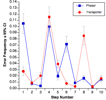
This is another domain in which there used to be a great solution, and now there’s not. The best old-school graphing program for my money was Cricket Graph. Unfortunately, that died a long time ago. The closest thing to that, and what I have used for years now, is DeltaGraph. DeltaGraph is generally pretty good, though there are times when some of the features are better-hidden than they should be. A lot of operations require double-clicking on bits that aren’t immediately obvious, and you have to be pretty precise because double-clicking a few pixels away can give you the wrong dialog box; for example, you can end up with the dialog for grid lines and tick marks when you wanted the dialog for the axis title and units. On the other hand, DeltaGraph does a great job handling fussy bits of the graphs, like error bars. Graphs like this one, where the error bars are different for every graphed point, are actually handled quite well in DeltaGraph:

PastedGraphic4.OZYj9UzAT7Yu.jpg

My only real gripe with DeltaGraph is that it’s getting a bit long in the tooth. It hasn’t been updated in some time and while it runs in OS X, it still feels like an OS 9 application in a lot of ways. Plus it’s gotten buggy and now generates more random crashes than it should. I’m starting to think that it’s been abandoned by its developers and so I’m now keeping an eye open for a new graphing program.

OmniGraphSketcher looks promising, but it doesn’t handle error bars well and so I can’t really go that way yet. Apple’s Numbers and Keynote have the same problem (that is, they also don’t handle error bars well). SPSS is a nightmare when it comes to graphs. Programs like ChartSmith and Aabel look like they might be OK, but they’re bloody expensive.

So, while DeltaGraph is hanging in there so far, I’m “in the market,” as it were. Suggestions welcome…

Confessions of a Mac Junkie: Drawing and Diagrams

For some people I am exactly the wrong person to ask about this. I am not artistically gifted; if anything, I’m one of those people who has trouble drawing a straight line even with a ruler. So what suits me here may not suit you, particularly if you’re artistically inclined. For me, doing drawing and diagrams on a computer is a godsend, because that’s the only way something even remotely reasonable can possibly be generated.

To wit: I don’t use Adobe Illustrator as anything other than a way to give a quick edit to something in a PDF file. Illustrator, for me, is like giving a huge load of fireworks to a 9-year-old. It might be fun and something pretty could happen, but mostly it’s just really dangerous for everybody. It’s like going after a fly with a bazooka, etc., you get the analogy.

For me, Illustrator is too general-purpose. Most of the drawing and diagrams that I do are flowchart-like system diagrams and stuff like room layouts. I don’t freehand draw, I put arrows in between labelled objects. My tool of choice for this kind of thing is OmniGraffle Pro, despite the goofy name—WTF is a graffle, anyway?

I think of OmniGraffle as a diagramming tool which also happens to support some more general-purpose drawing. While it has some foibles, it is generally an excellent piece of software which not just lets me do what I want, but helps me do what I want, because in this domain, assistance is much appreciated.

Years ago I used to use Inspiration as both my outliner and my diagramming program, but Inspiration, while it runs in OS X, really hasn’t kept up with the times.

The bad news is that OmniGraffle isn’t cheap. The Pro version retails for $200 ($120 academic), which is not trivial for software that isn’t, for me, an everyday piece of software. However, when I really need a flowchart or something similar, I really need one, and OmniGraffle is the way to go for me.

I’ve looked at other programs like LineForm and Intaglio and while they seem like nice drawing programs, they aren’t really diagramming tools, and I need a diagramming tool. LineForm is sold explicitly as an Illustrator competitor, and while certainly a lot less expensive than Illustrator, it’s $100. (Considering that academic bundles that include Illustrator can be had for only a few hundred, that’s not much of a savings.) Intaglio is somewhat less full-featured and slightly cheaper ($90). Intaglio does have one particularly cool feature for those of us who have been around for a while: it can open ClarisDraw files. I wasn’t a big user of ClarisDraw but that may be a big deal to the few folks out there who were. So, if you’re in the market for a moderately cheap but decent drawing (but not really diagramming) program, though, those seem like good things to look into.

I guess the other tool to discuss here is Zengobi’s Curio. Curio is a funky but likeable program but it’s very hard to describe. It’s sort a graphic information management tool, and it includes drawing tools and outlining and a whole bunch of other stuff all in one package. While I do occasionally use Curio, I don’t use it as my primary diagramming tool because it just isn’t as good at diagrams as OminGraffle. Curio’s name will come up again (and could have already as a presentation program, because it’ll do that, too) because it has features that touch on many other areas.

Quick Review: TweetDeck for iPhone

My App Store review, in blog form…

First and foremost, I love the price. Free with no adware, that’s perfect for a Twitter client. I’d pay a buck, maybe two at most, for a Twitter client. Five bucks is right out.

However, TweetDeck has some issues:

• It crashes… often. Usually on launch, and other times for no apparent reason. This should be the developer’s #1 priority.
• It misses tweets! If someone you follow does an @reply but tries to broadcast it using “.@,” TweetDeck still doesn’t show it.
• I know the hipsters all love the white-on-black color scheme, but I’d really like at least the option to go with the more traditional black-on-white. This is particularly problematic in really bright light conditions.
• Needs better support for #hashtags. Right now they don’t do anything.
• I’d like the option to launch a URL in Safari rather than in TweetDeck itself.
• No landscape mode for composing tweets.

It’s a good start for a 1.0 and could be great… certainly worth hanging onto for the price, though I’m going to keep an eye on TweetFlip…

Confessions of a Mac Junkie: Presentations

First, some context: I give a substantial number of presentations, because I do a majority of my class lectures using presentation software. Thus, I probably give 50–100 presentations a year. This means I spend a fair amount of time in presentation software, so again, I’m rather particular about it. However, it should be pointed out that none of these are marketing or motivational talks; these are all technical in nature. They aren’t snazzy and I don’t make a lot of use of animation or fancy effects, because I want people focussed on the content, not the presentation itself.

There are really only two serious players in this market: Apple Keynote and Microsoft PowerPoint. There are a number of minor players in this market, whereby I mean software that really does something else, but also happens to support some kind of slide show or presentation features. This list includes things like OmniGraffle Pro, Curio, DeltaGraph, and I’m sure many, many others. Many of those are nice, but they aren’t really centered on presentations and I give enough that I need a dedicated tool.

This one is actually a no-brainer: Keynote is my tool of choice, hands down, no contest. Frankly, PowerPoint blows goats. There is almost nothing that PowerPoint does better than Keynote, and Keynote can read and write PowerPoint files, so why bother with it?

However, in the interest of fairness, there are a couple things PowerPoint does do better. The main thing is drawing. PowerPoint has a wider range of drawing tools, and handles things like arrowed connecters between objects dramatically better than Keynote. (Keynote only recently added arrowed connectors at all.) Mostly I don’t consider this a big deal, since if I’m going to do a really complex diagram I’m going to do it in a dedicated drawing program like OmniGraffle anyway. The one place where there’s some real advantage here is that if you want the diagram to appear in stages (that is, via animation), then you basically have to draw it in the presentation software, so PowerPoint does get a point over Keynote here.

However, that’s pretty much it. PowerPoint is slow, generally much klunkier to use, more expensive, and generally vile. The most amazing thing about PowerPoint is how it has consistently failed to improve from one version to the next. The 2008 version is just simply not better than the 2004 version. If you want to mess with the animation of your bullet points, this still requires digging through multi-level dialog boxes. I hear that if you’re using PowerPoint on Windows, it’s better. There’s irony there—is there serious competition for PowerPoint on the Windows side? My impression, though I admittedly don’t really know, is that there isn’t. Yet there is serious competition on the Mac side, and that competition is staggeringly better, yet PowerPoint doesn’t seem to be getting any better in order to compensate.

Note that it hasn’t always been this way. For a long time I used PowerPoint because of its superior support for equation editing in an external editor (MathType). Since one of the classes I teach every year is statistics, I need to present a lot of equations. So I’ve stuck with PowerPoint just for that feature. The current version of Keynote has stepped up and now supports MathType, and last fall I dumped PowerPoint completely.

If you’re still using PowerPoint on the Mac, I’d highly recommend you look at Apple’s Keynote; it’s just simply better.

Confessions of a Mac Junkie: Input Devices

By input devices, I pretty much mean “mouse and keyboard.” Keyboard first:

The best keyboard ever made in terms of key feel, for me, is easy to identify: the Apple Extended Keyboard II (AEK2). Unfortunately, Apple stopped making those in the early 1990s, and they never made a version using USB. I gave up using my AEK2 in the late 1990s when I started seeing compatibility problems with the driver for the ADB-USB adapter.

Frankly, I don’t like any Apple keyboard offering; I don’t like the key feel for any of them. For many years, what I used was a Logitech Elite keyboard. The feel is not great, but better than the Apple keyboards around or any of the other third-party competitors that I got my hands on. Most current keyboards use membranes rather than individual switches for each key, which is why most modern keyboards feel mushy. I tried the Matias Tactile Pro which is supposed to use individual switches like the old AEK2, but the one I got was defective and the manufacturer never returned my attempts to contact them or return it, so I dumped it (and never got my money back—great customer service!). So, the solution ought to be a keyboard based on scissor switches, which is how the better laptop keyboard are made. The problem is that I don’t like the feel of most of those because the finger travel distance is too small.

Anyway, I did finally tire of the feel of the Logitech Elite, and briefly reverted to my old AEK2 when I discovered that the OS X drivers for the ADB-USB adapter worked pretty seamlessly. While I loved going back to that old feel, I still wasn’t satisfied, for multiple reasons. First, the 18-year-old keyboard sometimes dropped keystrokes (very bad), there are no media controls on the keyboard, and the keyboard is really loud. Keyboard loudness never used to bother me, but my life has changed since the late 1990s and now I do enough teleconferencing that a noisy keyboard is highly inconvenient.

Fortunately, someone finally made a decent Mac keyboard: the Logitech DiNovo Edge for the Mac. Yes, it’s terribly expensive. Yes, it lacks a numeric keypad. And it’s a scissor-switch keyboard. However, they’ve increased the travel distance over other scissor switch keyboards and the feel is pretty good—no, still not as good as the AEK2, but better than the Elite or any of Apple’s offerings. It has a great set of media keys as well as a trackpad and scrolling controls. It’s quiet. It’s low and flat, so it doesn’t screw up my negative-tilt keyboard shelf. It’s Bluetooth, which so far seems much less flaky than the wireless USB solutions I’ve used before. And as a final side benefit, it’s gorgeous, though that’s also probably a significant factor in the expense (the top is cut from a single piece of glass).

Next, the mouse. This is a terrific example of a technology where what’s good for learning is not what’s best for the skilled operator. From my perspective, it’s great to have lots of buttons on a mouse. However, if you want to see how this can fail, try teaching a 3-year-old to use a multi-button mouse. I’ve done this with both my kids, who are both smart and were motivated to learn. Small fingers aren’t the whole problem, the issue is the fact that with multiple options for clicking, they’ll use them all, won’t remember which to use, and cause glitches when they click with the wrong one. It’s a mess, because the left button is the one used some 90% of the time and the other button is just a distraction.

On the other hand, I’m not a little kid. In fact, I’ve been using a mouse more or less daily for the last 22 years. (As usual, insert your favorite age joke here.) At this point, I want a mouse with some extra buttons—in fact, lots of extra buttons! Of course a scroll wheel, but not just any old scroll wheel, one that also tilts to do horizontal scrolling. I like programmable buttons for “back,” click lock, close window, gesture, and Exposé. I’d rather not have to go back to the keyboard if I don’t have to, and this array of extra stuff right on the mouse allows me to keep it to a minimum. This rules out any Apple offering; the mighty mouse or whatever they call it lacks for extra buttons.

So, that’s a lot of extra buttons. I also like my mouse to have a good feel in my hand, track well, and wireless is also nice (Bluetooth preferred but not required.) If wireless, that means it will have an on-board battery so a battery charge indicator right on the mouse is also useful. Obviously, I’m pretty picky about this.

So far the mouse that I’ve found that best does all this is the Logitech Revolution MX, so that’s my desktop mouse. It’s quite excellent. I almost gave up on it when I first tried it because the shape is pretty extreme and I didn’t immediately like it, but it’s grown on me. I’m still not sure the previous-generation shape (e.g., the old MX700 or more recent G7?) isn’t actually better but I’m willing to live with the MX. It’d be even better with Bluetooth, of course, because as I said, wireless USB is sometimes kind of flaky.

So, there are my choices for keyboard and mouse. Yes, I’m a little OCD about it, I know, but I put a lot of hours in on them, so why not get good ones?

Final note on Logitech: I never had any intent of becoming a Logitech fan. And Logitech has an extremely sketchy track record when it comes to the software on the Mac side; Logitech Control Center is notoriously buggy. Turns out the DiNovo Edge is already a Mac keyboard and works just fine without the Logitech software. The mouse can be driven perfectly well with third-party shareware; both USB Overdrive and SteerMouse work great with Logitech mice. So I don’t run the Logitech software at all.

Confessions of a Mac Junkie: Introduction

OK, so it’s not football season and my blog is suffering from neglect. But classes are over and I can only watch so many movies, even on blu-ray, in a week. The last couple summers I’ve used the little down time I have in the summer to read a couple novels. Since the sequel to The Name of the Wind isn’t going to be out for a while, nothing on that front really grabs me right now. Thus I’m starting a new series on the blog, which I’ll try to update about once a week. So, what is this all about?

I’ve been using Macs since I started college in 1987 (insert your own age joke here). One of the things I often find myself asking when I meet other Mac aficionados is “what X do you use?” where X is software for some particular purpose, or hardware, or whatever. And I’ve noticed over the last few years that people ask me that question a lot.

So, I thought I’d document some of the storehouse of Mac knowledge and preference buried in my brain. Why should anyone care? Well, I have to confess that I have a problem: I’m a junkie. I’m completely addicted to Mac stuff, hardware, software, peripherals, you name it. There are (at least) four fully licensed word processors and at least three such spreadsheet programs on my hard disk. There are probably five or six keyboards in my study right now. I spring for MacUpdate Promo bundles and MacHeist bundles pretty much whenever they happen. I am, sadly but most definitely, addicted to this stuff—but it means my opinions are generally pretty well-informed and backed by a fair amount of experience.

Here are some planned topics, though I probably won’t go in this order:
• Word processors (and maybe reference managers)
• Mice & keyboards
• Web browsers
• Presentation software
• Utilities (this will take many posts as I’m especially addicted to these; I’ll need to generate multiple sub-categories)
• Spreadsheets
• Audio editing
• How I keep my multiple Macs in sync (I get asked this particularly often)
• Drawing and diagrams
• Graphing
• Outlining/brainstorming
• Text editing
• Image editing for the non-’shopper?
• Blogging/twittering?

And I’m open for suggestions on others. Let my addiction work for you…

One last sidebar. This will most definitely not be any kind of Mac vs. PC holy war stuff. I find that tiresome. I made a choice, it’s my choice, it’s not a choice borne of ignorance or incompetence, and I really don’t give a rip if there are people who don’t agree with it. Nor do I expect other people to be swayed by my choice, so I’m not going there. If you want that kind of utterly unproductive nonsense I’m sure there’s a thread on Fark or Gizmodo where people are fighting it out—there nearly always is.

Now, I will dip my toes into some the muddy waters of dissent on the Mac side, because it is germane to the topic. LaunchBar vs. QuickSilver. BBEdit vs. other text editors. There will be Microsoft-bashing, but only for some applications; and don’t worry, there will be Apple-bashing, too.