Confessions of a Mac Junkie: Graphing

OK, so in my last confession I noted that Excel is my spreadsheet of choice. I should note, however, that there is one thing I absolutely do not use Excel for: graphing. My work is technical enough that I regularly need to make graphs. Frankly, Excel sucks for this. Excel’s defaults are awful. Here’s an exercise for the reader: make a bar graph using Excel’s defaults, and print it on a monochrome printer. You get gray bars on a lined gray background, making it visually impossible to differentiate anything. Nice job, Microsoft! (Now, you might argue that nobody uses monochrome anymore, but that’s not true; most journals in my field still print in monochrome, so they only take monochrome figures.) Furthermore, Excel handles the size of graphs in bizarre ways. If I know I want the x-axis to be 4 inches long, I guess you can get there in Excel, but woe to you if you try to simply resize the window—the graph resizes as well. Bleah.

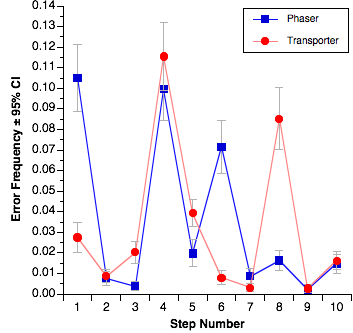
This is another domain in which there used to be a great solution, and now there’s not. The best old-school graphing program for my money was Cricket Graph. Unfortunately, that died a long time ago. The closest thing to that, and what I have used for years now, is DeltaGraph. DeltaGraph is generally pretty good, though there are times when some of the features are better-hidden than they should be. A lot of operations require double-clicking on bits that aren’t immediately obvious, and you have to be pretty precise because double-clicking a few pixels away can give you the wrong dialog box; for example, you can end up with the dialog for grid lines and tick marks when you wanted the dialog for the axis title and units. On the other hand, DeltaGraph does a great job handling fussy bits of the graphs, like error bars. Graphs like this one, where the error bars are different for every graphed point, are actually handled quite well in DeltaGraph:

PastedGraphic4.OZYj9UzAT7Yu.jpg

My only real gripe with DeltaGraph is that it’s getting a bit long in the tooth. It hasn’t been updated in some time and while it runs in OS X, it still feels like an OS 9 application in a lot of ways. Plus it’s gotten buggy and now generates more random crashes than it should. I’m starting to think that it’s been abandoned by its developers and so I’m now keeping an eye open for a new graphing program.

OmniGraphSketcher looks promising, but it doesn’t handle error bars well and so I can’t really go that way yet. Apple’s Numbers and Keynote have the same problem (that is, they also don’t handle error bars well). SPSS is a nightmare when it comes to graphs. Programs like ChartSmith and Aabel look like they might be OK, but they’re bloody expensive.

So, while DeltaGraph is hanging in there so far, I’m “in the market,” as it were. Suggestions welcome…

Confessions of a Mac Junkie: Drawing and Diagrams

For some people I am exactly the wrong person to ask about this. I am not artistically gifted; if anything, I’m one of those people who has trouble drawing a straight line even with a ruler. So what suits me here may not suit you, particularly if you’re artistically inclined. For me, doing drawing and diagrams on a computer is a godsend, because that’s the only way something even remotely reasonable can possibly be generated.

To wit: I don’t use Adobe Illustrator as anything other than a way to give a quick edit to something in a PDF file. Illustrator, for me, is like giving a huge load of fireworks to a 9-year-old. It might be fun and something pretty could happen, but mostly it’s just really dangerous for everybody. It’s like going after a fly with a bazooka, etc., you get the analogy.

For me, Illustrator is too general-purpose. Most of the drawing and diagrams that I do are flowchart-like system diagrams and stuff like room layouts. I don’t freehand draw, I put arrows in between labelled objects. My tool of choice for this kind of thing is OmniGraffle Pro, despite the goofy name—WTF is a graffle, anyway?

I think of OmniGraffle as a diagramming tool which also happens to support some more general-purpose drawing. While it has some foibles, it is generally an excellent piece of software which not just lets me do what I want, but helps me do what I want, because in this domain, assistance is much appreciated.

Years ago I used to use Inspiration as both my outliner and my diagramming program, but Inspiration, while it runs in OS X, really hasn’t kept up with the times.

The bad news is that OmniGraffle isn’t cheap. The Pro version retails for $200 ($120 academic), which is not trivial for software that isn’t, for me, an everyday piece of software. However, when I really need a flowchart or something similar, I really need one, and OmniGraffle is the way to go for me.

I’ve looked at other programs like LineForm and Intaglio and while they seem like nice drawing programs, they aren’t really diagramming tools, and I need a diagramming tool. LineForm is sold explicitly as an Illustrator competitor, and while certainly a lot less expensive than Illustrator, it’s $100. (Considering that academic bundles that include Illustrator can be had for only a few hundred, that’s not much of a savings.) Intaglio is somewhat less full-featured and slightly cheaper ($90). Intaglio does have one particularly cool feature for those of us who have been around for a while: it can open ClarisDraw files. I wasn’t a big user of ClarisDraw but that may be a big deal to the few folks out there who were. So, if you’re in the market for a moderately cheap but decent drawing (but not really diagramming) program, though, those seem like good things to look into.

I guess the other tool to discuss here is Zengobi’s Curio. Curio is a funky but likeable program but it’s very hard to describe. It’s sort a graphic information management tool, and it includes drawing tools and outlining and a whole bunch of other stuff all in one package. While I do occasionally use Curio, I don’t use it as my primary diagramming tool because it just isn’t as good at diagrams as OminGraffle. Curio’s name will come up again (and could have already as a presentation program, because it’ll do that, too) because it has features that touch on many other areas.

Confessions of a Mac Junkie: Spreadsheets

I don’t do a lot of serious work with spreadsheets. Most of my data either ends up getting dealt with in stats packages or if it’s something requiring anything custom, I’ll write a program of my own to deal with it. I use spreadsheets mostly for things like grade rosters, when I do my taxes, and for non-mission-critical work like fantasy football rankings.

I own three spreadsheets: Apple’s Numbers, Microsoft’s Excel, and Mariner Calc. Those of you who follow along here are probably expecting another round of Microsoft-bashing, so perhaps this will be a surprise, but I don’t think there’s any real contest here: Excel is clearly the champ here.

Before I get into this, another historical note: my favorite Mac spreadsheet used to be Informix Wingz, which was then later rebranded as Claris Resolve. Powerful functions, great graphics, and a macro language which was actually parseable by humans (based on HyperTalk, how cool is that?). This was software that was way, way ahead of its time in 1989—no current spreadsheet is nearly as good. Progress is, unfortunately, not always forward.

This is a battle of attrition: I don’t really like Excel all that much, but the other two are just not ready for prime time. Mariner Calc is OK, but it lacks the statistical functions that I need (like z-, t-, F- and chi square distributions), I’ve found more than one error in calculations (I’ve reported them and Mariner claims that they’re fixed, but who knows if there are more?), and the UI just doesn’t make it. For example, when you’re in a cell, the row and column indicators don’t change to indicate where you are in the spreadsheet, like so:

Untitled.r86ArkrhLy6p.jpg

Not really that big a deal when you’re in C5, but when you’re in K39 it’s often useful to know, visually, what row and column you’re in—like in every other spreadsheet I’ve ever used. I requested this feature ages ago, but Mariner never did anything with it. This is just a dumb UI fail, a “please don’t buy our product” signal from the developers.

Now, Numbers. Numbers is an interesting effort from Apple, an attempt to kind of change the paradigm for spreadsheets. Instead of the “sheet” being the basic unit, the “table” is the central unit, and each sheet can have multiple tables—and of course each document can have multiple sheets. This is kind of interesting and there are certainly advantages to doing things this way, but it does add a lot of clutter if you just want one single very large table (and no others) because there’s all this screen real estate devoted to managing multiple tables in a sheet that you won’t need. OTOH, there are some cool things that this enables, as multiple separate tables on a single page can be useful, particularly for things that have to be printed out. So, there are things about Numbers that I like, but there are just as many that I hate. Here are the two things I hate the most:

• Exporting from a Numbers document is incredibly cumbersome. This is important, because lots of other apps like simple and dumb, but also highly portable, you-know-everything-will-be-able-to-read-it-in-10-years formats like tab-delimited text. First of all, Numbers doesn’t even support tab-delimited text. WTF? It supports CSV, but I hate CSV because CSV files aren’t as human-readable, and commas are crappy delimiters because lots of data has commas in it one way or another. Second, Numbers handles multiple sheets/tables incredibly stupidly: you can only export the entire document, every single sheet and table, or nothing. You can’t just export the part you want. Mind-numbing.

• Sorting is stupid. Numbers won’t let you sort only a part of a table; again, it’s all-or-nothing. (Technically, this isn’t quite true; it’s possible to sort only some rows, but when you do, it still sorts all columns for those rows. Ugh.) This just defies any reasonable logic whatsoever. Well, maybe that’s a little harsh. This completely defies my mental model for how a spreadsheet should work, and I can’t stand it. I don’t care how much of a “new paradigm” this thing is supposed to be, it should not completely break major chunks of previous knowledge about how spreadsheets work.

The other kind of stunning thing about Numbers is that there’s no way to edit a Numbers spreadsheet on an iPhone—at least, none that I’ve been able to find. The great irony is that there are many iPhone apps that will allow you to edit Excel spreadsheets on an iPhone, but not Numbers. (Double irony: Mariner’s Calc iPhone app will let you edit Excel sheets, but not Calc sheets. WTF?) Hey, Apple, fantastic job on platform integration there! (Side note: I like having small spreadsheets on my iPhone for small tasks, and usually all the editing I do is enter data onto them, but that’s enough that it’s useful.)

So, the winner—again, mostly by attrition—is Excel. I’m not thrilled with Excel, of course, as the launch time is hideously long and it has some UI quirks of its own, and of course is full of Microsoft bloat. However, Excel seems to do a better job of containing that bloat than the other Office apps and so it’s bearable. I think this is an area where a third-party really could compete with the big boys, but none has yet risen to the challenge.